The Invisible Salesman: How a Single Button Can Double Your Revenue
In the world of digital marketing, we spend thousands on SEO, high-end photography, and professional copy. Yet the most critical moment of the entire customer journey often comes down to a tiny rectangle: the Call-to-Action (CTA) button.
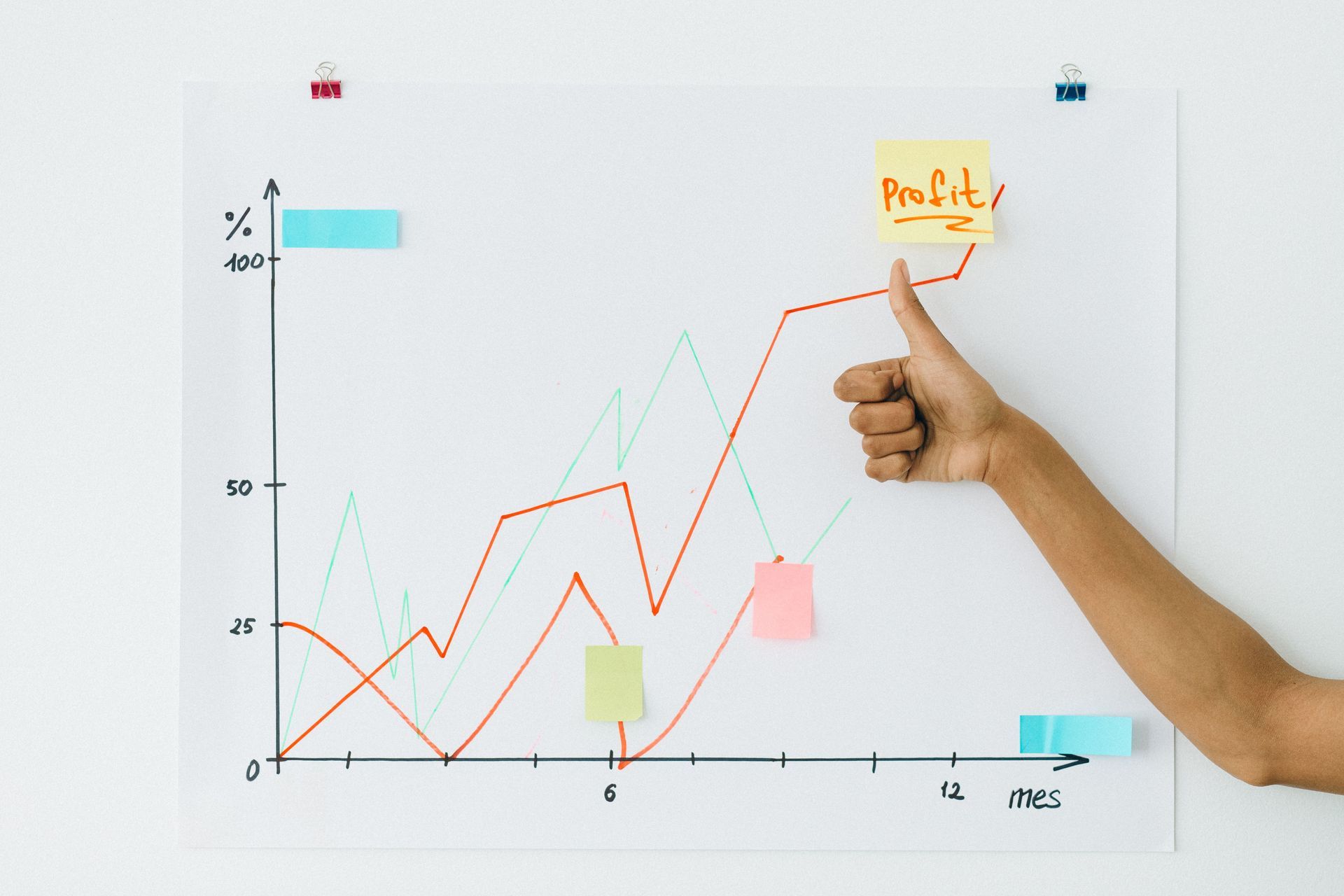
A well-crafted button is more than just a design element; it’s a psychological trigger. Research shows that clear, specific CTAs can increase conversion rates by as much as 161%. If your "Buy Now" button isn't performing, you aren't just losing clicks—you’re losing revenue.
Here is the anatomy of a website button that actually sells.
If you are a home care or home health agency, and the phone isn’t ringing, consider the following:
1. The Psychology of Color: Contrast is King
There is no "magic" color for sales, but there is a magic principle: Contrast. Your button must stand out from the rest of your site’s palette. This is known as the Von Restorff Effect, which suggests that the eye is naturally drawn to the element that "stands out like a sore thumb."
- Red: Creates a sense of urgency and excitement, often used for flash sales or clearing out stock.
- Green: Communicates safety and growth, making it ideal for financial services or eco-friendly brands.
- Orange/Yellow: Friendly and energetic, these colors attract attention without the "danger" associated with red.
Pro Tip: If your website is mostly blue, try an orange button. If it’s white and grey, a bold black or red button will grab the most focus.
2. Copywriting that Converts: Benefits Over Actions
The biggest mistake businesses make is using "friction words" like Submit, Register, or Buy. These words imply work or a loss of money. High-converting buttons focus on the reward.
- Instead of Submit: Try Get My Free Guide as it focuses on the value received.
- Instead of Buy Now: Use Add to Cart. This lowers the psychological pressure; implies browsing
- Instead of Register: Try Start my Free Trial as this uses first-person language to create ownership.
Using "My" instead of "Your" (e.g., "Start my free trial") has been shown to boost click-through rates by up to 90% because it makes the user feel like they already own the benefit.
3. Strategic Placement: Follow the Eye
If a user has to search for your button, you’ve already lost them. Effective placement follows the natural "flow" of how humans read:
- Above the Fold: Ensure at least one primary CTA is visible without scrolling. This captures the "impulse" visitors immediately.
- The F-Pattern and Z-Pattern: Users scan pages in predictable paths. Place buttons at the end of these paths—usually the center or bottom right of a section.
- The "Point of Action" Assurance: Place a small trust signal directly under the button, such as "No credit card required" or "30-day money-back guarantee." This reduces "buyer anxiety" at the exact moment of decision.
4. Design for the Thumb
With more than half of all web traffic coming from mobile, your button must be "tappable."
- Size Matters: Buttons should be at least 44px tall to ensure they are easy to hit with a thumb.
- White Space: Surround your button with "breathing room." Clutter around a CTA confuses the brain and leads to "choice paralysis."
Key Takeaway
A button is the final gate between a visitor's interest and your business's profit. By combining high-contrast design, benefit-driven copy, and low-friction placement, you turn a simple UI element into a powerful engine for successful sales.
If you need assistance with your website buttons, contact Kenyon HomeCare Consulting at 206-721-5091 or email gkenyon@kenyonhcc.com
Results Based Consulting
Did you find value in this blog post? Imagine what we can do for your home care or hospice agency. Fill out the form below to see how we're leading the industry with innovation, affordability, and experience.
Contact Us